ARTIST IN RESIDENCE: MORNÉ VISAGIE

ARTIST IN RESIDENCE:

MORNÉ VISAGIE

Why is blue the last colour to fade? 

Morné Visagie is a South African artist, printmaker and curator who lives and works in Cape Town. He is represented by WHATIFTHEWORLD Gallery, South Africa, and NUWELAND Gallery, The Netherlands.


Growing up on Robben Island towards the end of Apartheid South Africa, the Atlantic Ocean that separated Visagie from the Mainland became a recurring metaphor in his imagination, and for the past decade, the colour blue has been the primary medium in his work; a personal symbol of death, loss, nostalgia, memory, religion, sexuality, exile and distance.


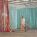
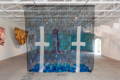
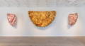
Morné is Krone Vintage-Only MCC’s first artist in residence, in association with WHATIFTHEWORLD. Morné’s master exhibition The Last Colour to Fade, was hosted by Krone and WHATIFTHEWORLD gallery at Twee Jonge Gezellen in Tulbagh.


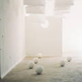
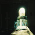
In The Last Colour to Fade Morné moves with deft fluidity between personal recollections and collective history. He pairs his childhood island, its physical and psychological landscapes, with reflections on art, literature and film, drawing on the work of Damon Galgut, Derek Jarman, Jean Genet, Virginia Woolf and others in a poetic engagement with the sea and its symbols. The Last Colour to Fade – a collection of twelve discrete works – marks an abstracted expression of Visagie’s themes.

Morné Visagie, Artist

Tell us about your MFA title, The Last Colour to Fade?

The title, The Last Colour to Fade, raises two questions. The first being, what is the last colour to fade, but then what is the first?


In this exhibition, colour is primary. Here, the restrained palette of blues, reds and golds are expanded into bodies of colour. The bodies of colour are, in part, abstract interpretations of references taken from literature, film, and memory. They are, too, purely evocative fields, which inspire a sense of wonder and pleasure. Paying careful attention to visual harmony, the colour, line, shape and form of these works are visually arresting.


During one of my recent visits to Robben Island, a friend remarked on some photos hanging on a wall that it’s interesting that blue is always the last colour to fade.

The Last Colour to Fade, 2019, Short Film

With water being a common and recurring presence, how did the showing of your work in an agricultural setting change the reading of the exhibition for you?

The building on Twee Jonge Gezellen in which the exhibition was presented is reminiscent of a bathhouse, with its lime-washed moulding walls. The windows, as round portholes, bring to mind a boat, a sea voyage. The creaking of the ceiling as it expands and contracts under the sun suggests the aural illusion of a rocking ship, and the sun-flooded arched entrances the setting of a church.


It created the ideal setting for this body of work. Within this building the works could exist outside of the sterile environments that galleries can so often be. Twee Jonge Gezellen and this building in particular became an island in its inland setting.

Tell us a little about your residency experience. And how did the solitude of the residency affect your practice and process?

The time spent at Twee Jonge Gezellen was bliss. Time away from a busy social life, work, other projects, and the general city life, gave me time to properly focus on my research, writing and to reflect on what the essence of this body of work was or had become. It was your picture perfect “artist residency” out in the country, with flowing MCC!


The residency gave me the time to patiently install artworks and rehang over and over again until it was right. For me this exhibition was a research based body of work. I got to live with it, installed, every day and had the opportunity to see how the light changed the shapes and colours in the space from sunrise to sunset. This is something that artists hardly ever get to do due to time pressure and space limitations.


I worked hard and constantly, and the space motivated that drive. For me, personally, it was the first time that I could fully immerse myself in this project.

Installation Shot from The Last Colour to Fade, 2019

In contrast, how has self-isolation during the covid-19 pandemic affected your practice, having happened so soon after your masters' exhibition?

It has unfortunately put a hold on various projects and exhibitions that were scheduled to take place this year. I rely heavily on the assistance of a seamstress, as well as for the collection of recycled materials (such as the used MCC foils). During the lockdown period I have instead been focusing on other curatorial projects and research. I generally tend to have on and off periods of actual making of artworks. I like to spend a long time reading and researching, conceptualising ideas and planning new works. This fuels the final production of the works.

Your video, The Last Colour to Fade, reads as a sequence of snapshots of memories and impressions centred around water. Can you talk about the significance of these locations?

The imagery was filmed on Robben Island and in the Long Street Baths, Cape Town. Some of these rooms and the outdoor swimming pool, I remember from my childhood, growing up on Robben Island in the early nineties during Apartheid South Africa.


The film weighs the surrounding works with a more distinct visual reference, and creates a narrative of colour that weaves the exhibition together. The film’s visuals focus on abstracted architectural scenes. Its images are a meeting point between childhood memory and adult experience.


The swimming pool has been a recurring subject in my work over the last ten years. Together with the sea, the swimming pool has been a theme, a language, used throughout queer films, literature and art. Personally, the swimming pool and related works I’ve produced, are also a homage to my own relationship with my partner.

Let's talk about your foil sculptures, How You Are Fallen from Heaven, O Day Star, Son of Dawn?, Sinner I, Sinner II. In relation to the other pieces in the show, this piece reflects rather than absorbs light and colour. Can you give us some insights into these pieces?

When I started collecting the foils (with the assistance of Krone) and sewing them together, I was uncertain of my intention. I liked the material, its colour, strength and malleability. After cleaning, flattening and sorting, the foils were sewn together, following the natural curve of their circular form, which gives the works their circular shape. The shape that the sewn foils took on mimic that of a priest’s cloak, similar to Matisse’s chasubles, the interior of a Baroque Church, outspread wings or the sun’s reflection on the sea’s horizon.


The foils are the residue of a popped bottle of champagne – the remnants of events passed. They allude to celebratory occasions and thus form part of the illusion, ideal of happiness and romance. But the gold is illusory. It is not real, but fake. I am drawn to this idea of an unattainable, idealised moment of happiness.

Sinner I, How you are fallen from Heaven, O Day Star, Sun of Dawn!, Sinner II, 2018-2019, Collected and sewn Methode Cap Classique foils

Which work did you find most challenging to produce?

Considering the scale and construction of most of the works in the exhibition, I really struggled with the knitted plastic pieces. They were made from recycled plastic bottles, which I turned into ribbon and knitted together. I couldn’t resolve them and they felt separate from the rest of the exhibition. I still don’t think they were resolved. What shape were they supposed to take on and what was their purpose?

Tell us about your approach to the curation of the show?

Ideally each work would have had its own room, to exist by itself. But the space was large enough to house all these works and give moments “to come up for air”. Viewed all in one go, it could be an overwhelming amount of colour and texture. The works were positioned according to the entrances of the building, and through this I attempted to create “chapters”- an introduction, a body and a conclusion. As you enter the gallery, you are met with the transparent blue quilt, through which you view the rest of the works, before walking around it, and entering the space completely. The foil works, suspended and raised to above head level, holds the space and demands attentions. A passage of suspended blue tissue curtains leads you out of the main gallery space into another room, where the film is playing. Here the exhibition ends, until you leave this room and view the works in the main gallery with a new perspective, and visual references, provided by the film.

You have worked a lot with repurposed materials. How do you find the experience of working with repurposed materials compares to working with 'new' materials?

My practice has always involved gathering or making many components to create one piece. And usually each component would be made from scratch, whether it is from paper or porcelain. At times I have collected different sand and butterfly chrysalis shells.


Found and collected used objects have memory and resonance. However, it’s important how these objects are used and in what context. Whether it’s been a new or used material, it’s always had to undergo some form of transformation in order to become something new. But the original use has to be acknowledged and considered how this relates to my work. In the case of the MCC neck foils, it was not important where exactly each foil came from, but rather what each foil represented.


There is a lot of work involved in working with either new or used material. With paper, this has to be torn down, dampened, printed onto, dried, dampened again, stretched etc. The foils were collected, flattened, cleaned, sorted, arranged and sewn.

Untitled, 2019, Tissue Paper and Porcelain.

There is a definite air of fragility in the exhibition. It appears that the beauty of perishability is a consistent theme running through the work. What drives you to work with materials that feel so impermanent?

I think this comes from my training as a printmaker and working with fragile materials and understanding their strength and qualities. The tissue paper is strong and holds light so well, but it will dissipate in water immediately. The tarlatan has absorbed so much ink that it cannot be used to wipe another etching plate, but light passes through it as though it were stained glass windows.

How did you find the process of creating the short film at Twee Jonge Gezellen with Jonathan Kope and Claire Johnson?

It was so easy working with Claire and Jonathan. They had done their part in understanding the exhibition and approached every element in a considered and knowing way, but also introduced new perspectives which I enjoyed and found refreshing. It was a wonderful way of activating the exhibition and these works, which I’ve been labouring over for two years, almost through a kind of performance.

Find out more about the KRONE X WITW Artist Residency Programme here

Photography: 

Jonathan Kope & MATTHEW BRADLEY


VIDEOGRAPHY: 

JONATHAN KOPE & CLAIRE JOHNSON


ORIGINAL MUSIC WRITTEN AND RECORDED BY ALESSANDRO GIGLI


This website uses cookies. By continuing
to use it you accept our use of cookies.